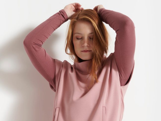
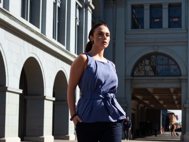
Sisterly
Premium Product Curation & Lifestyle Art Direction
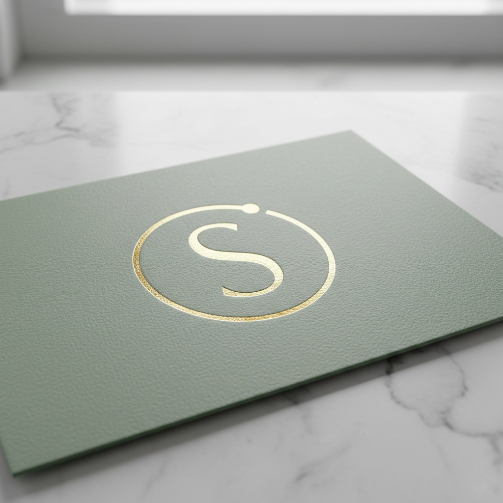
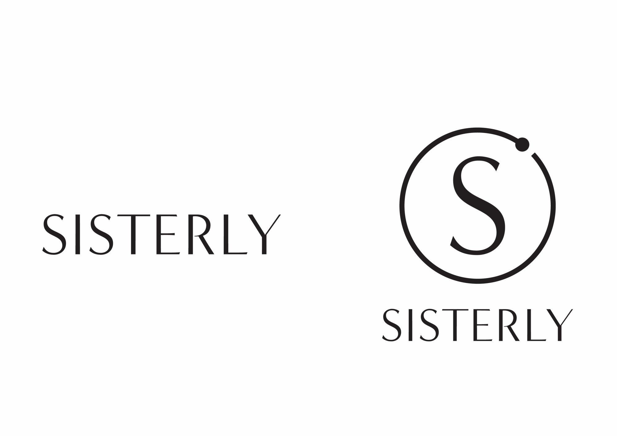
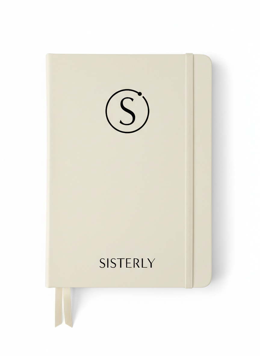
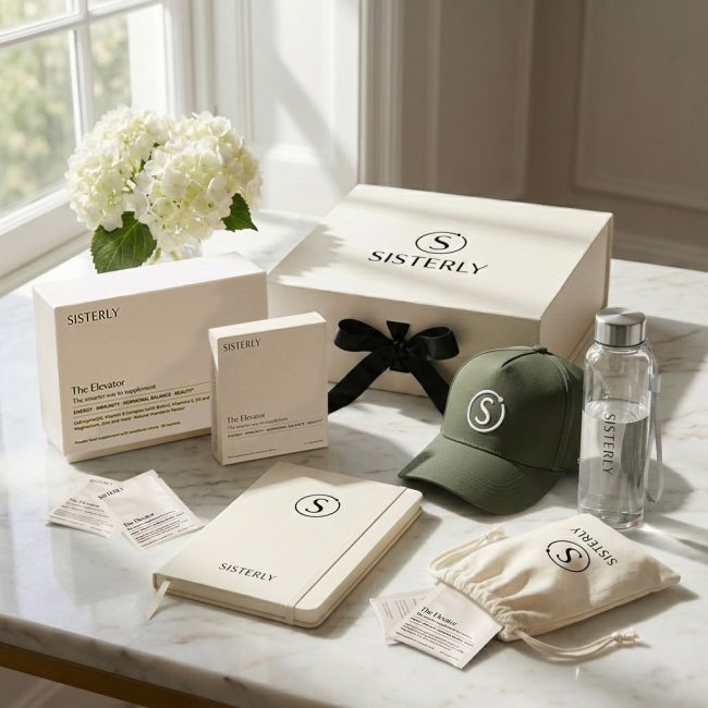
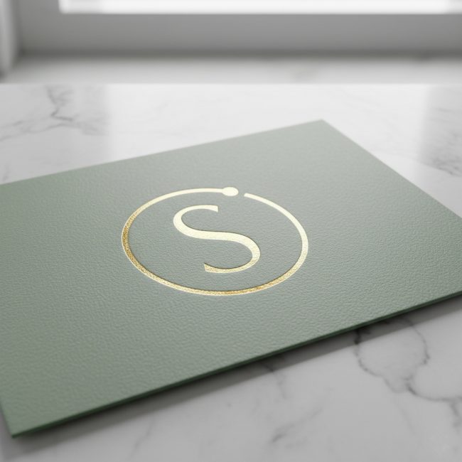
The Brief: To develop a versatile brand mark that distilled the essence of the Sisterly wordmark into a singular, iconic symbol for physical applications.
To elevate the brand’s physical presence, I developed a versatile circle mark that distills the essence of the Sisterly wordmark into a singular, iconic symbol. The goal was to create a high-functioning asset capable of maintaining visual harmony across all scales—from large-scale environmental graphics to refined, tactile details on premium goods. This identity expansion ensures a cohesive brand experience, allowing the mark to stand alone as a sophisticated signifier of quality in both digital icons and bespoke physical applications.